

Just a few decades ago, we would record data gathered through research and surveys in spreadsheets like Microsoft Excel or Google Sheets. To show the implications of this data, a simple bar graph or pie chart drawn from the recorded data would do. This is called data visualization. Gathered data is no longer random or senseless. Now it can tell a story.
While this method was effective, graphs and charts cannot illustrate the story the way maps do.
Maps represent the physical world we live in and help us visualize what the bigger world looks like beyond the limits of our five senses. They help us answer questions like: Where am I? Where do I go? What routes can I take to get there? What are the places near me?
But maps have gone beyond just a representation of the topography of the world. They can also tell deeper stories about the world. They help us answer other questions like: Where is traffic the heaviest? Where can I sample the most popular food items? Where should I go to finish my errands fastest?
This is where data mapping visualization comes in.
Data mapping visualization presents geographical data in an aesthetic and intuitive manner. One look and you’ll be able to have pertinent information about a particular geographic location.
Why is it helpful?
When Is The Best Time To Use Interactive Data Visualization Tools In Your Custom Map
Because time is a precious commodity, efficiency is of prime importance. We need to make quick decisions based on interactive data. You’ll be able to make efficient use of your time with data map visualizations that lead to intuitive decision-making.
Because beauty is something we crave as humans, we want data to be presented in a way that captures our attention. There’s nothing like a cool, interactive map to draw our eyes in!
Because we want to be able to mine for more information without having to go to different web pages, an interactive data map visualization helps us to ask further questions and get quick answers from one page alone.
With all these reasons, you’ll be able to understand why it is important to choose the right type of visualization when you make your map.
There are different ways to visualize map data.
Types Of Data Visualization
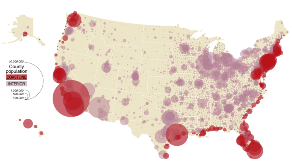
Proportional Symbol Map
A proportional symbol map uses symbols of varying sizes in order to represent the quantitative value of a particular variable associated with a geographical location. For instance, to show the population of a particular region, a circle of different sizes may be used.
This kind of data map visualization intuitively gives the viewer a quick comparative analysis of the quantitative data.
Heat Map
Heat maps present different levels of quantitative data through varying hues or intensities of colors. They show how varied or how similar a phenomenon is in a particular location.
This type of data map visualization can illustrate which factors are of most or least importance for a specific locale, as well as intuitively show the intensity of certain phenomena in it, such as the occurrence of a disease.
Choropleth Map
A choropleth map is similar to a heat map in that it uses colors to represent the differences in the value of the data visually. However, with choropleth maps, the division of geographical regions is visible, while they are conspicuously absent from heat maps so that “hotspots” are highlighted.
Just as in a heat map, this kind of data map visualization easily shows the density of a specific occurrence in a geographical location.
Cartogram Map
Cartograms alter the geographic size of regions in a map according to the variable value, such as income level or population density.
By distorting the size of the geographic locations, this type of data map visualization shows emphasis in a more abstract manner.
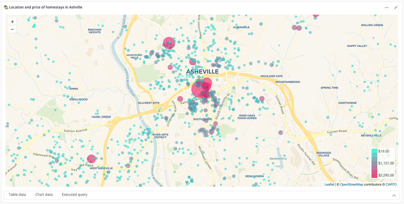
Point Map
A point map plots data over a specific location on a map. The dots vary in size based on the value of the variable. The difference between a point map from a proportional symbol map is in the former’s placement of the point on the exact longitude and latitude of the location.
This kind of data map visualization easily displays the “hotspots” of the variable, such as the concentration of parks, restaurants, and the like in a town or city.
Line Map
Line maps are useful in showing routes on a geographical location, such as subways and transportation routes. This type of data map visualization can also show how often those routes are being used or how accessible they are.
Three-dimensional Map
A 3D map is the most realistic data mapping visualization among the types we have illustrated. It can realistically show paths and obstacles on a route, as well as landmarks and structures alongside the path.
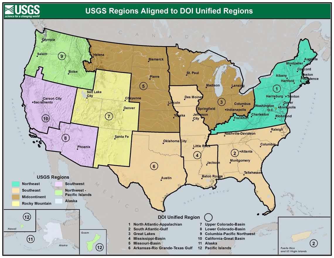
Regional Map
Regional maps show pertinent information on a specific geographical location. It is useful in presenting more in-depth and varied data for that region.
How Do You Make One For Your Interactive Map
Get Your Data Set
Location data can be retrieved from spreadsheets like Microsoft Excel or Google Sheets. This data can come from manual inputs of a survey or research data or export from database software like Improvado or Postgre SQL.
Find The Right Mapping Tool
There are three kinds of data mapping tools available: open-source data mapping tools, on-premise data mapping tools, and cloud-based data mapping tools.
How do you know which type of data mapping tool is right for you? It depends on the ease of use and the resources you have available.
Open-source data mapping tools are free to use and collaborative. If you don’t have the financial resources available to pay for the other types of data mapping tools, but you have the programming know-how to customize and contribute to the open-source data mapping tool, then go for this option.
On-premise data mapping tools are software that needs to be installed in one’s gadget. You can go for this option if your device has the capability to run the software and store the output without significantly affecting its performance for other tasks.
Cloud-based data mapping tools are a good choice if you don’t want your data mapping activities to encroach on your device storage or affect its performance. It is heavily dependent on the quality of your internet connection and may be more vulnerable to security breaches.
Pick The Right Type Of Data Visualization
Picking the right type of data visualization from among the options we have given depends on the story you want to tell.
Do you want to showcase trends?
Do you want to emphasize density?
Do you want to compare options?
Do you want to illustrate distribution?
Do you want to show connections between different factors?
When you know the answers to these questions, you can go back to the description of each data mapping visualization and make the right choice.
Examples Of Data Visualizations
Here are some of the best examples of data visualization maps.
Proportional Symbol Map

A proportional symbol map of the county population in the United States, including a comparison between the coastline and interior populations.
Heat Map

Choropleth Map

Cartogram Map

A cartogram of the 2020 US Presidential Elections with location size distorted to reflect the population density.
Point Map

An example of a point map showing the location and price of AirBNB listings of Asheville, North Carolina.
Line Map

A line map of the subway in the Greater Washington.
Regional Map

A regional map of the United States Geological Survey.
For the best interactive maps, check out Proxi’s viral maps here.
Adventure Awaits!
Check out some of the latest articles on our blog


