

Maps are an incredibly useful tool for businesses, as they provide a visual representation of data that can be used to inform strategies and drive decision-making. Excel is a powerful program that can be used to create detailed interactive maps representing real world situations. We'll explore creating a map in with data in excel for a hypothetical business that wants to understand their customer's behavior better.
Read on to learn more about data mapping in Excel, how to make a map in Excel and the benefits you can gain from doing so.
Collecting and Preparing Data
Collecting and preparing data to make customer maps in Excel requires careful planning. First, you need to choose a geographic location to map. This could be a city, state, or country. Next, gather data for the map. Relevant data includes customer addresses and contact information. Finally, you can format the data in Excel by creating columns for each piece of information and entering it into the appropriate cells.
Adding Geographic Data to Excel
Geographic data types include address, city, state/province, country, zip code/postal code, latitude, and longitude coordinates. To add geographic data to Excel, you can use the Geocode Add-in or manually enter the data into the spreadsheet.
Once you have added the geographic data to your spreadsheet, it is important to clean and format it properly so that it can be used in mapping applications. This involves making sure all of the addresses are in a consistent format (e.g., the street name followed by city), removing any unnecessary characters or spaces from fields such as zip codes or latitudes and longitudes, and ensuring that all of the countries are spelled correctly.
With properly formatted geographic data in your spreadsheet, you will be able to create accurate maps of your customers' locations for analysis purposes. This can help you to further your business initiatives and start learning from your customers based on geographical information.
Creating a Map in Excel
Excel mapping options allow users to create maps in Excel. The platform’s Map Chart tool can be used to create a geographic visualization of data, such as countries, states, and zip codes. It is also possible to add custom shapes and regions to the map. To format a map in Excel, users can customize the color scheme, adjust the size of labels or markers, and add additional elements such as lines or arrows.
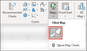
To turn your table into a map:
- Go to the "Insert" tab.
- Select the "Maps" icon.
- Insert the "Filled Map."
It’s also possible to apply filters to highlight specific data points on the map. With these features, users can easily create an interactive visual representation of their data with Excel maps. The various tools and customizations available make these maps an attractive option for many different types of businesses that work with different types of customers.
Tips for Formatting the Map
Adding data to maps in Excel is a great way to visualize and analyze information. Linking data to the map can be done by creating a table of geographic coordinates or using an existing address field. You can edit your map by going to the "Chart Design" tab in the main menu. Here are some tips to make your map easier to understand:
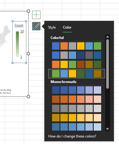
Color code your map. Color codes help the reader understand trends in your map quickly. Excel will color code your data by default, but you can adjust the colors used.
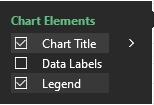
Give your chart a title. To do this, click on your map then select the plus sign. This will open a chart element window and you can toggle on or off the title. If your excel map's title reads "Chart Title," you can double click on the title and edit the text.
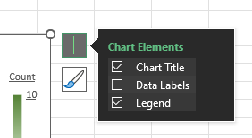
Labels can also be added to the map, such as customer names or product categories, which further enhances its usefulness for analysis. With these features, customer maps in Excel become powerful tools for understanding customers and their needs. You can toggle on data labels by following the same steps you used to toggle on a chart title.

Zoom in on the region with data. By default, the map will show the region containing your data, but you can drill down even further. When you click on your map, it should open a right panel displaying Formatting Options. Select the bar chart to show "Series Options." From there, adjust the "Map area" to "Only regions with data."
Advanced Excel Map Features
Advanced Excel map features allow users to create detailed and informative maps. Custom shapes can be added to the map by importing a shapefile, which is a file format used for geographic data.
Multiple layers can also be added to the map, such as demographic information or sales territories.
Heat maps are another feature that allows users to visualize data in relation to geographic locations. They use color-coded values to represent different intensity levels, allowing users to quickly identify trends and patterns in their data.
Saving and Sharing the Map
Saving maps as images or PDF files is one of the most common ways to share them with others. By doing so, you can easily attach the map to emails, upload it online, or print it out for physical distribution. Embedding the map in a document or presentation is another option for sharing customer maps in Excel. This method allows you to include the map directly into your document or presentation without having to create a separate file for it.
It also makes it easier for viewers of your document or presentation to interact with and explore the data represented by your map. It can be a good idea to experiment with different saving and sharing methods to find what works best for your organization. Some viewers may prefer to view maps via email, while others find maps embedded in presentations to be most valuable.
Ultimately, it’s important to find the method that works best for your organization and that will allow you to convey information as succinctly as possible. This can keep everybody on the same page and help prevent misalignment between processes, strategies, or analyses.
Conclusion
Creating customer maps in Excel is a great way to visualize customer data, learn more about their behavior and, by extension, find ways to better meet their needs. The process of creating these maps in Excel involves importing the data into the software, formatting it correctly, and then using the Maps feature to create an interactive map. This enables users to easily manipulate data and get a visual representation that can be used to identify relevant trends.
Excel is powerful and simple to use, making it an excellent option for multiple types of businesses. It requires minimal technical knowledge and is thus accessible even to those with limited experience with mapping software. In addition, its flexibility makes it possible to customize maps according to specific needs or preferences.
If you’re looking to make a map from data, you might also consider Proxi, which allows users to create customized, interactive maps. With features such as custom categories, subtags, and social preview media image links, Proxi can be a valuable tool for those wanting to make better use of their customer data.
Adventure Awaits!
Check out some of the latest articles on our blog